Engagement: Commissions for Wearing Velvet and Island Dam
- Mar 14, 2019
- 5 min read
Wearing Velvet
'Just Like Christmas' Music video:
I'd already had some experience collaboration with my musician friend and flatmate Rob Williamson of the band: Wearing Velvet. The following is a short bio they asked me to write for them to use on their band camp page:
"Wearing Velvet are a Manchester based alt pop 4 piece who merge all the interesting aspects of late 60's pop music with a modern dream pop relevance, cultivating a sound which is sure to captivate audiences instantly. Their music combines poppy melodies, dreamy synthesizers and stoic lyricism. This juxtaposition of styles results in an authentic, original and melancholic take on their musical influences."
However it wasn't only a short bio that I was asked to help them out with. In the spirit of multi-media collaboration I was commissioned a few times this year by Wearing Velvet for various artistic tasks. Just over the Christmas period I helped direct and shoot a short music video for a cover song they had made for the seasonal period.

VIDEO AVAILABLE TO VIEW HERE:
https://www.facebook.com/wearingvelvet/videos/206526456918803/
Band logo design and set list design:
There were some more marketing-minded contributions to the artwork that I would come to provide for them. The band needed a text-based logo, now that they had a band photograph taken. They briefed me that they wanted it to be simplistic, striking and reusable for tour poster, album covers and festival line ups.

They requested something akin to the 'Joy Division' text that had been displayed in this set of band logos, with an emphasis on the text being 'blocky' and in a 'wave-formation'.
This was the photo I had been given to work with (credit: Tara Perry https://twitter.com/tara_elizarose):

It didn't take long until the lads were happy with the formatting of the text, which was just a slightly warped and scattered body of text.


The boys decided that this was their favourite variation of the logo's colouring was one that was more discreet and that blended in the most with their surroundings.

This was then a house style that could be put to practical use for stage directions and official set list printings.


'In Between Moments' EP cover:
Rob came to me with this image taken from a Damon Eliza Palermo tour dates poster. He wanted a graphical image that would take heavy influence from this design. I knew how to recreate the same kind of aesthetics digitally in photoshop.

I scanned in some general dust that I found in my room to recreate the feel of the work being homemade. I even included one of my head hairs as a kind of signature for the work.

By messing around with my own set of colour gradients in photoshop I warped this rainbow into the composition. I then added the logo that the band wanted to consistently use for their next few pieces of work, I blurred them by 2 px so they would ever so slightly be out of focus and look all the more authentically printed.

They credited me on their band camp page and included a link to my twitter.

I've been happy to frequently collaborate with this band because not only are they my friends, but we have proven to work quite well together creatively, time and time again. I have every confidence that we will only keep on promoting each other in our relevant fields for years to come.
Island Dam
At first my old school-time friends, from back home in Wigan just wanted a logo designing for their band. They'd seen the work I had done for Rob Williamson and wanted to hire me to create some artwork for their band. Logo:
The first thing that they wanted was a logo for their Facebook page. I created simplified variations of a design that I thought reflected two key visual elements form the band name: (an island and a dam). From there it was a case of experimentation and development.

The logo went through some more iterations:


Before we settled on this one:

Which was then used in their Facebook page:

There are still quite a lot of this logo that I admittedly want to change up because of the work that I ended up doing for their EP cover.
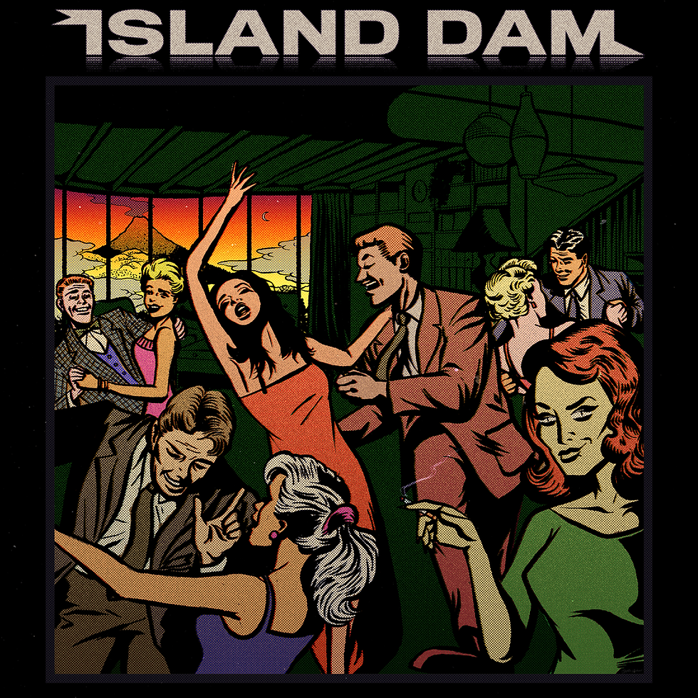
'Lizard Looking Lady' EP album cover:
I used noted on my phone to jot down my initial ideas I had for the artwork whilst I had a few listens that the band had prepared for me to draw inspiration from.
I ended up getting fixated on using an aesthetic that reflected the retro, public information comics of the fifties and sixties.

It's hard to pin how this very specific art style cam into fruition for this project but after I'd mood boarded the idea on Pinterest, the and members were really on board with the idea.


I then was able to make a composition out of the reference images I had researched. Once this was given the green light by the band to bring this all together, the following details the visual journey of development:


Once they were happy with the main EP cover, I was then able to add in the text that I had designed prior, the visual journey behind that is detailed here:


I then married these two designs together and had a back and forth with the band over the general layout.


These were the final images that ended up getting used:


And here one of them can be seen on Soundcloud:

In conclusion this has been such a vital piece of experience for myself as I do able myself as an animator/ illustrator and these projects have certainly let me build my portfolio on the illustration side of things.
I was hired as a freelance artist and I charged Island Dam a mere £175 for the detailed work I was able to provide them. They of course were my friends and the level of work I was giving to them was certainly being under-charged because of 'mates rates', however I'd put in many many hours of work that exceeded the charge of just-under £200.
I'd told them about how I had been paid £20-£30 an hour for some commercial work I had been involved with in the past but considering they were young, aspiring musicians it would be harsh to charge them the same kind of rates. We settled on £200 as my price for all of the total amount of work. I explained how this was far cheaper than any other professional they could get and to Nick Calderbank (singer & guitar) and Dan Henthorn's (guitar & keys) credit, they were willing to treat me as a professional if I was going to be treating them the same way. However, as the project went on, the price was then negotiated down to £175 because of other members of the band thinking they were being over-charged.

I have learned that I will have to go on the side of caution for the next friend commission I agree to. I really need to assert that my time and effort can't be paid for in 'exposure' or 'experience' any longer. To have the confidence and courage to assert and value oneself is something that is tricky but essential to master whilst doing freelance work.
(UPDATE: Below is a screenshot from their Spotify debut, featuring my artwork).


Comments