


Storytelling Script to Screen: Exquisite Corpse/ Character Design and more
- Jan 31, 2017
- 4 min read
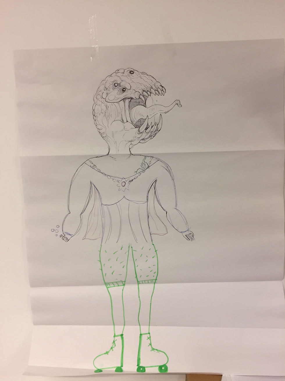
Jan 31,2017 This week is the first academic week of the new year and with semester 2, we have been introduced to a new module in our course: Storytelling Script to Screen. This session was a more relaxed introduction to the module, we will be given a formal paperwork-based briefing next week, but for now we were being thrown into this on strictly a drawing-orientated session. Kristen introduced us to one of our new course tutors, Chris, he appears to have a career based in realism and portraiture, From that, I can already tell that if this course is going to be as drawing-based as I think, I am going to really enjoy it. And this session did not disappoint, we started off by being split into groups of three and then folding up A2 pieces of paper, this was to be the 'Exquisite Corpse' exercise. Without our other group members seeing what we were doing we were to draw a head, a torso and legs of any kind on the A2 pieces of paper. The twist was that we had to swap our drawings around whenever we were to move from legs, to torso, to head. These were the results of myself, Luca's and Alice's work:


Here are some of my favorites from the rest of the class:


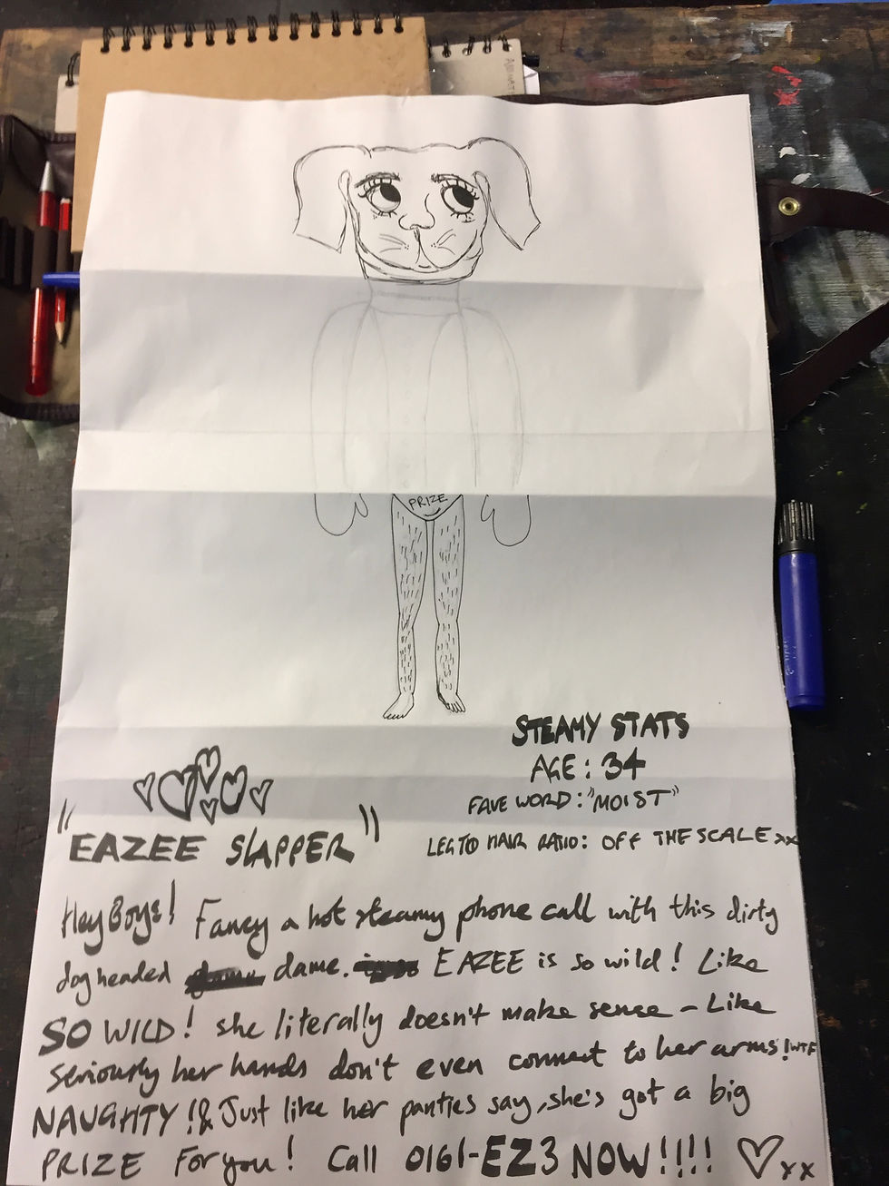
I then got given the results of one of the other groups exquisite corpse. Kris tasked us with creating a bio and some character detail for our assigned characters.

This is the bio I created for mine (In case you couldn't tell from my previously drawn efforts, I let my imagination go even cruder, here):
After presenting these (regrettably, in front of the class).
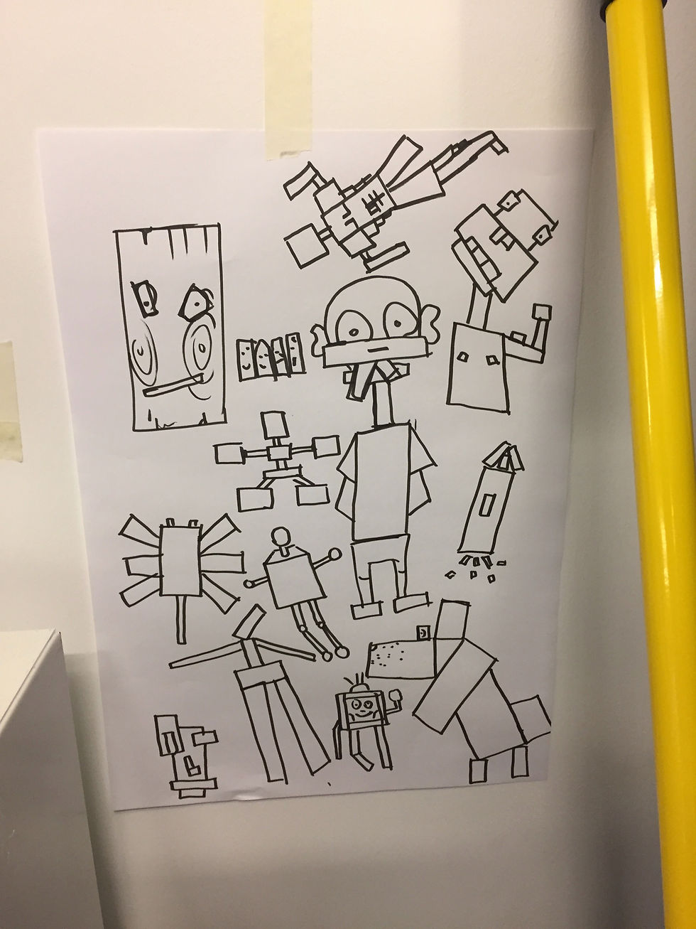
...Our groups were assigned a shape to draw characters out of.
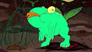
My group was tasked with circles here are my results: (These drawings were formed from just randomly doodling many clusters of circles together, the idea was to: 'Draw first and have ideas later'.)

(This secondary set of drawings focused on less circle clusters together and more creating a character around the individual shape. I really liked playing around with perspective and spacing in these circles.)

These were the results from other people in the class:


For next week we have all chosen two characters in the room that appealed to us as the most aesthetically pleasing, character-wise. These are the two that I have chosen:
I think they will work well in terms of visual contrasts for an antagonist and protagonist This is because the top character employs a rounded, simple and smooth set of features, which is juxtaposed to the bottom character's harsh, detailed and straight facial features.


I have also pulled the genre of 'Farce' out of a hat. With my chosen characters and genre I am to create a visual and character-based response. Hopefully the two will create a good creative fusion, as long as I can angle it correctly. I can see that the point in this task is to challenge our storytelling skills, I am excited to embark upon this task. This is something that I have done for most of my life during recreation time, and because of this I am excited to finally put my skills to the test on this course and prove what creative output I am capable of. Research of 'Farce' genre:
I have no idea what Farce really is, upon some quick research I came to find that it is this genre of film and television: "A comic dramatic work using buffoonery and horseplay and typically including crude characterization and ludicrously improbable situations" (Wikipedia, 2017)
After finding out that this is a version of absurdity humour, I feel, or at least I hope, that this task is tailored well to my strengths.
I made some brief notes on the characters I had the intention of creating:

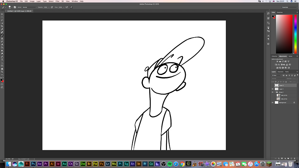
I started to sketch out some digital revisions of the initial characters and just had a general play around with my work.


I thought it would be best to really exploit every bit of visual difference I could, the expressions of both characters suggest one of innocence (left) and one of annoyance (right). The left character is also smaller in scale compared to the right character's large build. I also thought that the apparent age difference in the character's (left having next to no detail in face, whereas right has many wrinkles and aged features), would dictate the colour scheme. That is why I decided to use youthful and bright colours for the left character and muted, realistic colours for the right... This also was somewhat dictated by the synopsis of the character premise which will be made clear next...

After I was happy with the colour schemes I had chosen for my two characters I decided I wanted to move onto the poster image which would visualise the following synopsis: Luther Crossbridge has recently fallen into a work related depression and has subconsciously summoned the last happy memories he ever had, (embodied in the form of his childhood imaginary friend: Wox). However Wox is not as fun as Luther remembers and starts to reek havoc around the workplace with his gang of imaginary creatures, all of whom have no place within Luther's strict and regulated lifestyle. Will Luther ever be rid of these childhood demons? Or will Wox ever manage to convince him to return to his reckless childhood ways... even if it sends Luther insane? THIS IS: WOX AND LUTHER

Visual notes for poster: I decided that the main drive for colour, in relevance to character design here, would be to distinctly ground the real-world colours in the same muted and dull-set tones as the character of Luther. The bright and vividly colourful imaginary friends and the world they seem to be bursting from really contrasts well with said dull colour scheme. I look forward to seeing what my peers have come up with in the next Storytelling Script to Screen session. I know I'm going to love this module.


Comments