


Typography Development, Animatics and The beginnings of Making
- James Lawson
- Dec 1, 2016
- 3 min read
Dec 1, 2016 I started off this week's session by taking my foreign alphabets that I had written out last week (inspired by my foreign languages mood board, (see below), and decided which alphabet I wanted to develop.

Below are the scripts that I had drawn out:


I decided to digitally develop my script that was influenced by oriental languages. I felt that this was the most suitable script to use as an alphabet for our fictional city, as Japanese writing is prevalent throughout the Vapourwave culture and Blade Runner scenes I have also been researching. Below are three variants of how I wanted the non-calligraphic text to look.

On this page I played around with various brush types and colouring to be used later on in the process (especially when creating the backgrounds for our installation and text in our commercials.

I translated the word 'Govern' into my fantasy language, to be used as the key word for the embodiment of the sinister side of the city.

I took this word and played around with neon-effects in photoshop.


After that, the frame work for the subliminal message that is to appear at the end of my commercial started. I really just wanted to experiment around with what I planned to be the most effective shot at the commercial which is to be a sort of subliminal message.

After I had the text written out, I designed a logo, which is to be the symbol of the corrupted government:

I took this symbol and the subliminal text into Photoshop, to get a taste of what the final aesthetic will look like.


I overlayed a noise filter to create a TV static look. I then also created red and blue semi-opaque layers to give the image a bit of a glitch art aesthetic. I'll further look into making glitch art later on in the development process.

I have decided that getting the animation for the fictional commercial is something I MUST put to a president. Below is the storyboard I drew out for the fictional commercial. I have decided that the product will be like the adverts I was inspired by in the first session of this brief.

The commercial will be selling a cup-noodle-type food product that is endorsed and sourced by the corrupt government. What the audience will be able to make out is that this is actually a propaganda advert that aims to brainwash the city into eating food that will brainwash and subdue the city's residents even further.
ANIMATIC: I started off the animation by importing the storyboard image into adobe flash, and aligning each panel with a keyframe. This helped me to work out the timings of the video.


I placed a gif. file of TV static over the top of the stage, this is a placeholder for the glitch effects that I hope to add in post production.

I then marked out the layers of my animatic and organised them into colours. the components of each layer corresponded to their separate colours.


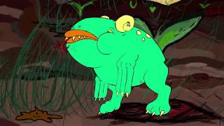
After that, I started drawing and animating more detailed motions in the characters.

After I drew out all of the motions, I placed in the government message at the end of the video.

SOUND:
I recorded most of the audio for the characters and voiceover on Adobe Audition:

These files were then placed into Adobe Premier. I also grabbed some more processed sound effects from Soundsnap.com.

After editing these together...

These were the results of my editing: Without sound:
Sound added:
Whilst I have been doing all of this TZ has been working on the background for our installation. This is how the background looks so far (they transition between night and day:
Next session, we will film our green screen material, which is to be projected over our backgrounds. I have suits and coats that I shall dress into to portray the characters such as the city's leader and the city's news reporter. I am slightly worried about getting all of our ideas together on time, but I am also confident in the competence of my team mates, that we will be able to pull this off.


Comments